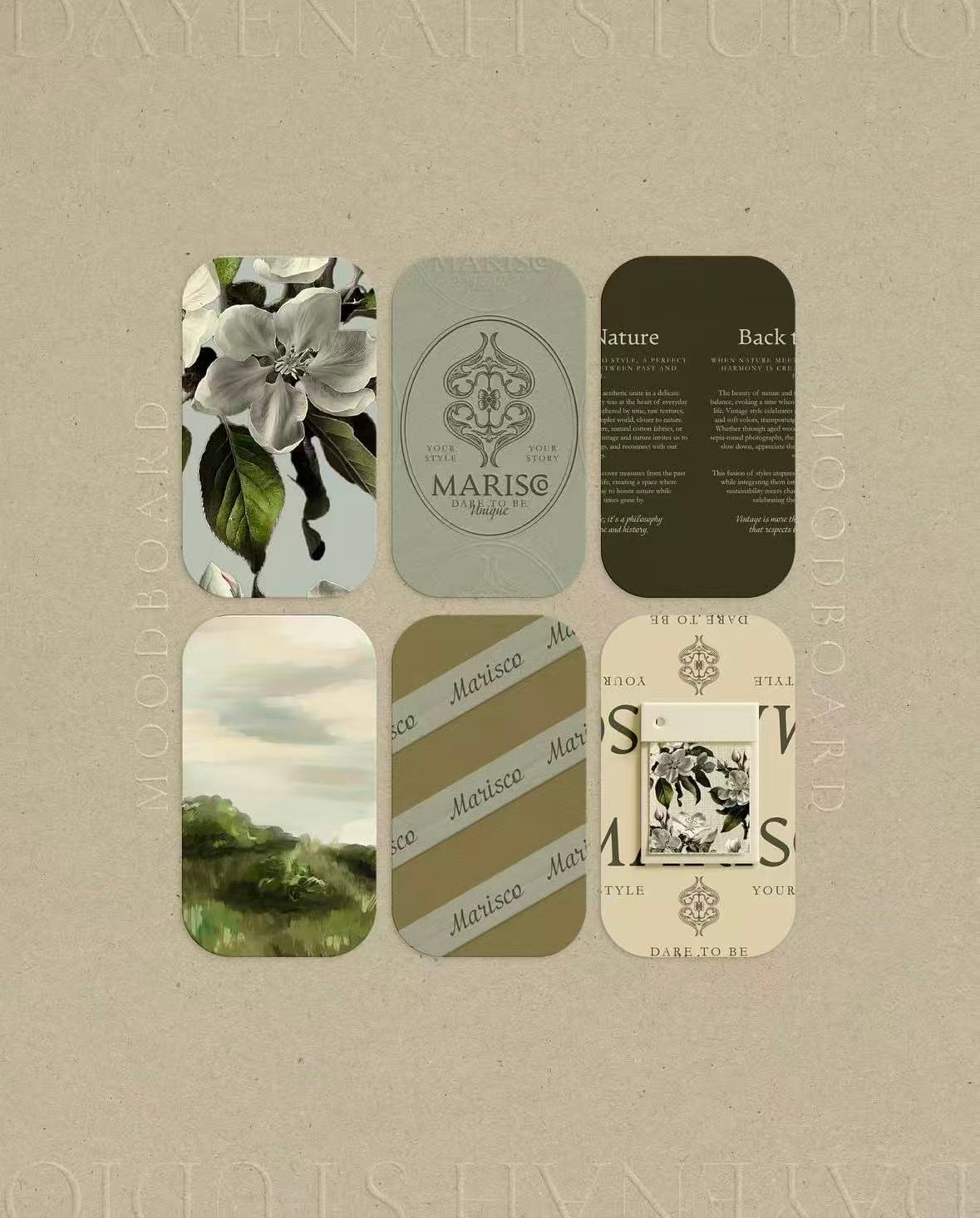
Colour is often treated as decoration, but in professional settings it functions more like tone of voice. Before anyone reads your name, colour has already suggested something about you—your pace, your standards, and the kind of decisions you make. This is not mysticism. It is pattern recognition: people associate colours with experiences, industries, and expectations. Used well, colour does not “sell.” It simply reduces uncertainty.
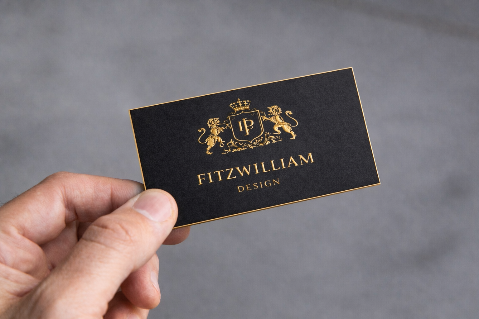
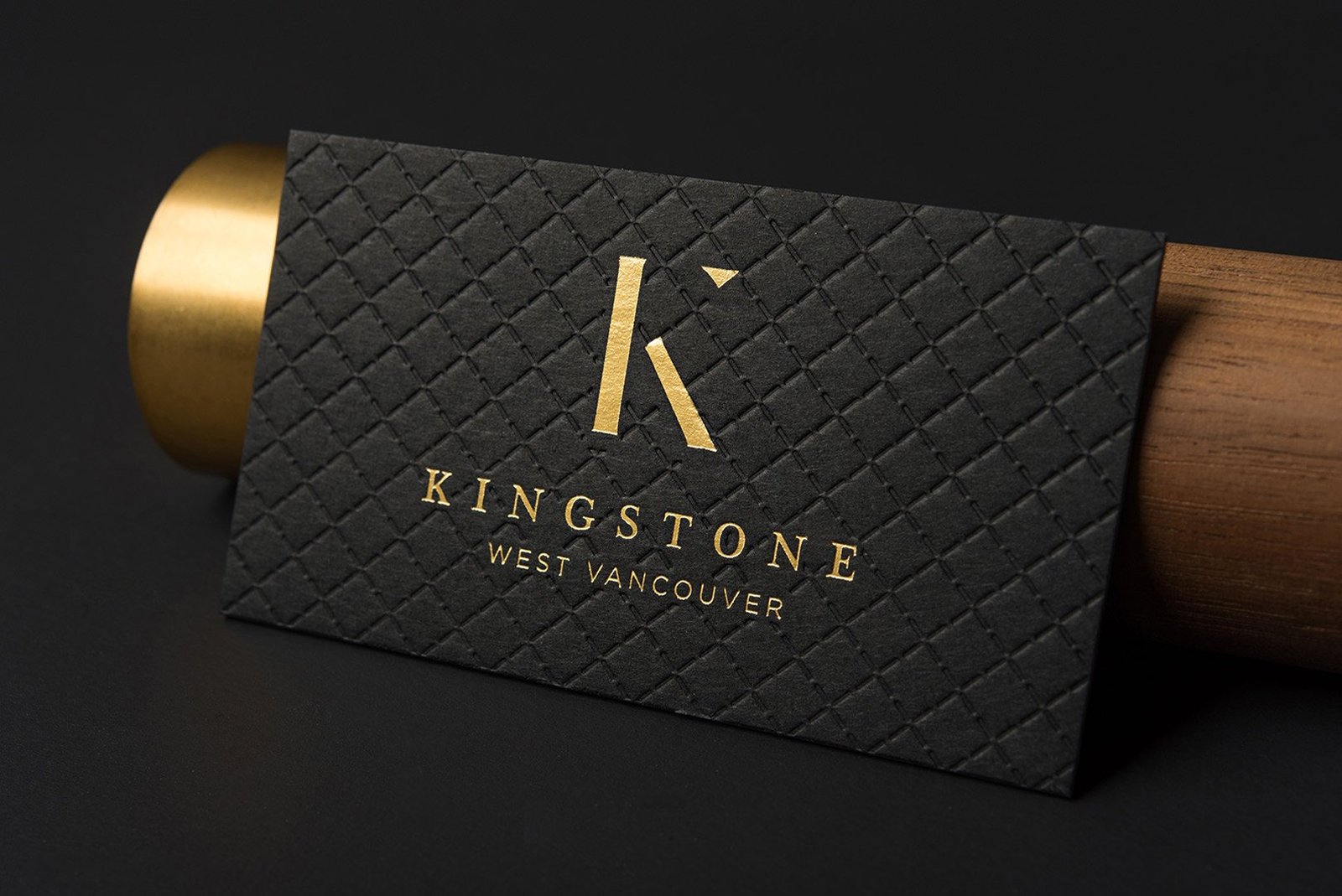
Black — authority, restraint, and high standards
Black is the classic choice when you want to be taken seriously without over-explaining. It signals authority and clarity—often associated with legal, finance, executive roles, and premium brands. The personality it suggests is controlled: decisive, selective, not eager to impress. The risk of black is not the colour itself, but the execution: low-quality black can look flat, dusty, or overly glossy. When done well, black feels inevitable.
Deep green — composure, heritage, and measured confidence
Deep green is often chosen by people who want luxury without showiness. It carries a sense of composure and tradition—less formal than black, warmer than navy, and quietly distinctive. In personality terms, it can read as confident but not loud: someone who values taste, detail, and long-term reputation. The key is tone: a deep, stable green feels premium; a green that is too bright or too grey can feel uncertain.
Navy — credibility, structure, and professional steadiness
Navy is the colour of reliability. It tends to suit consulting, corporate environments, technology leadership, and roles where clarity and structure matter. The personality signal is measured and methodical: someone who communicates well, follows process, and is safe to trust. Navy rarely offends, which is also its limitation—if your brand needs distinctiveness, navy may need a signature detail elsewhere.
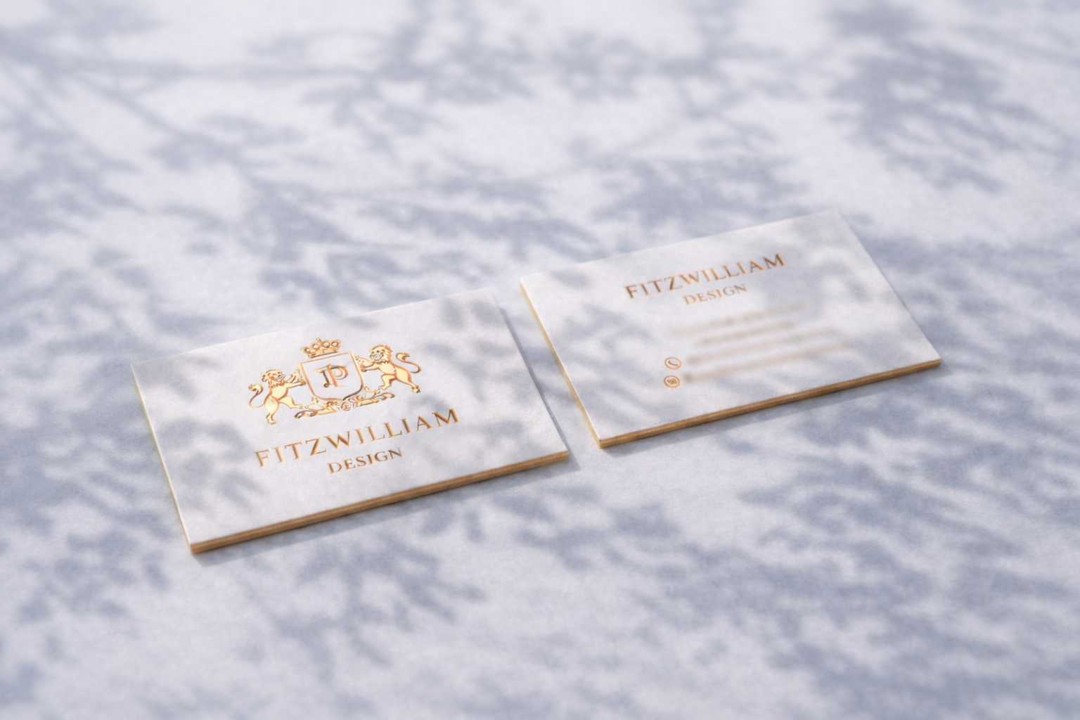
Grey and white — precision, modernity, and clean intent
Warm grey and crisp white can feel modern and design-led. They signal precision and taste—often used in architecture, design, premium services, and contemporary brands. The personality signal is refined: thoughtful, detail-oriented, and calm. The risk is legibility and “thinness”: if contrast is too low, the card can feel hesitant. With strong typography and clear hierarchy, grey and white read as confident minimalism.
A practical way to choose
If you want a simple decision rule, start with the impression you want after a first meeting: authority (black), understated prestige (deep green), steady credibility (navy), or modern precision (grey/white). Then test one question: does the colour still feel convincing under different lighting—office light, daylight, and phone camera? A good colour choice is not the one that looks best alone, but the one that remains consistent in real life.