Color is often treated as decoration, but in professional settings it works more like tone of voice. Before anyone reads your name, color has already suggested something about your style, standards, and the kind of decisions you make. This is especially true in premium business cards, where visual restraint and material quality often matter as much as the information itself.
People do not respond to color in a vacuum. They associate certain tones with industries, roles, and expectations. Used well, color does not need to “sell.” It simply reduces uncertainty and helps a card feel more aligned with the person or brand behind it.
Why Color Matters in Premium Business Cards
The best premium business cards are rarely memorable because they are loud. They are memorable because they feel coherent. Color plays a major role in creating that coherence. It influences whether a card feels authoritative, modern, discreet, creative, or refined.
This matters because business cards are often judged quickly. A strong color choice can support trust and recognition before the details are even read. In that sense, color is not separate from design. It is one of the clearest signals a card can send.
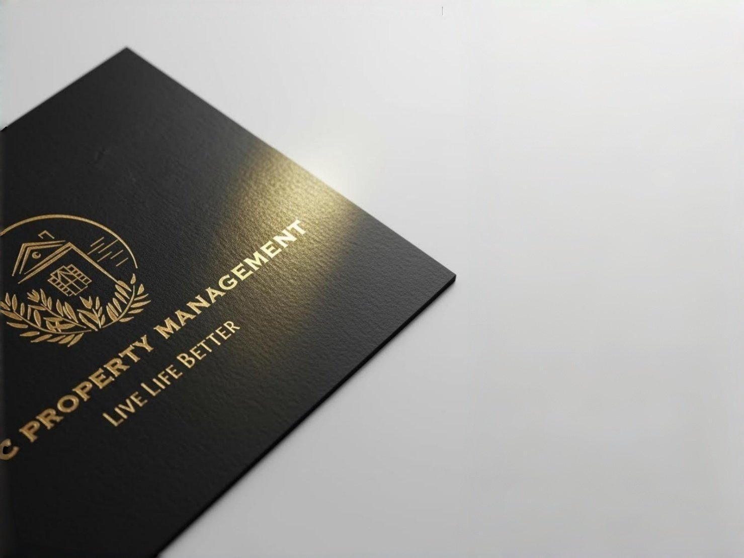
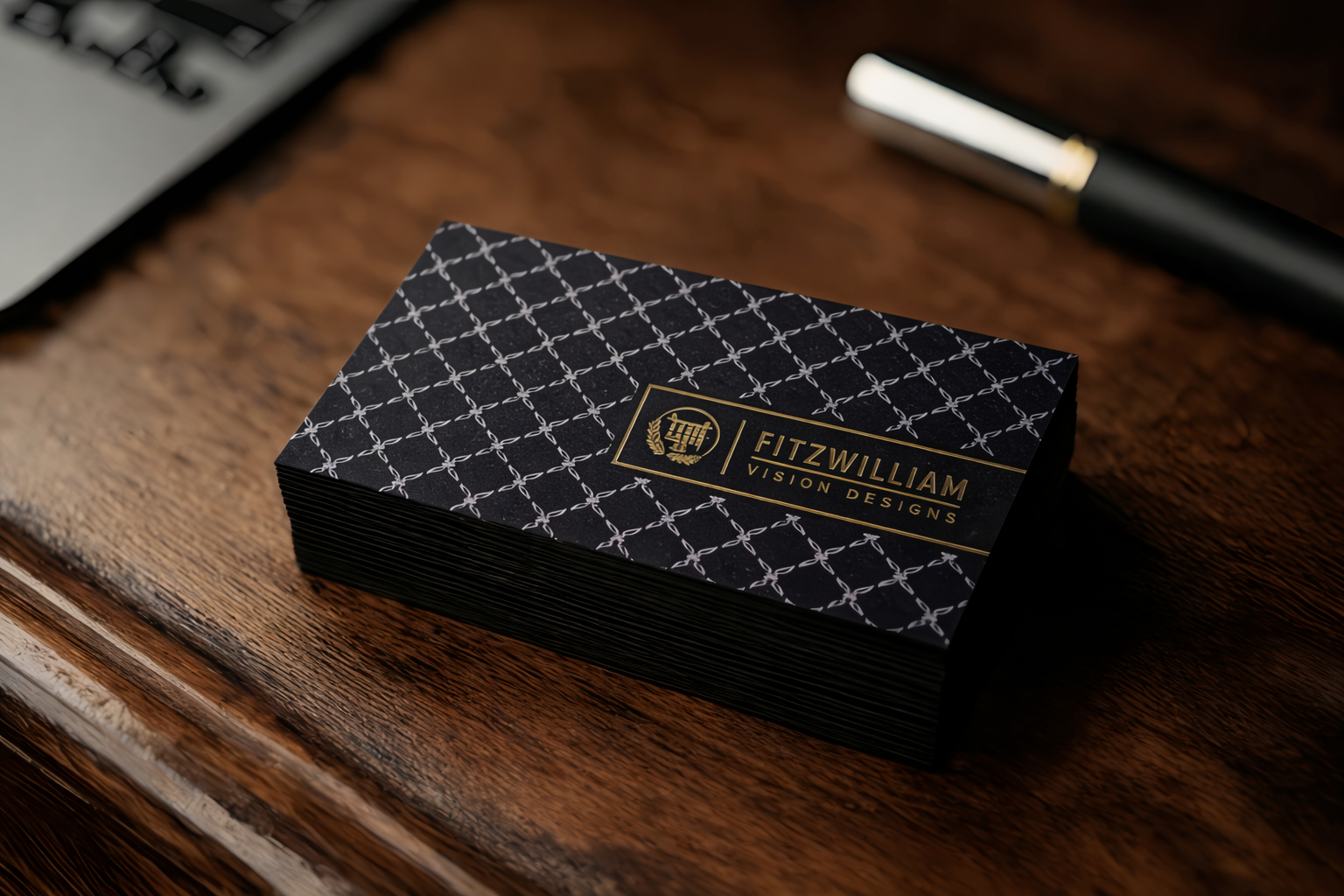
Black Business Cards: Authority and Precision
Among the most popular high-end options, black business cards are often chosen for their clarity and authority. Black suggests control, discretion, and high standards. It is especially effective in fields where confidence and professionalism need to be communicated without excess.
When executed well, black can make a card feel sharp and inevitable. But the quality of execution matters. Low-quality black can feel flat, dusty, or overly glossy. The strongest result usually comes from the balance of color, typography, finish, and paper stock.
This is why black business cards often work best when the layout is clean and the details are handled with care. They are not impressive because they are dark. They are impressive because they feel deliberate.
Navy Business Cards: Structure and Professional Confidence
If black feels too severe, navy business cards offer a strong alternative. Navy still communicates credibility and structure, but in a slightly more approachable way. It is often well suited to consulting, finance, corporate environments, and other roles where reliability matters.
A well-designed navy card can feel measured, calm, and highly professional. It carries enough depth to feel premium, but with a softer tone than black. For many brands, that balance makes navy one of the most versatile choices in professional print.
Like black, navy depends on execution. If the shade is too bright or too dull, the effect weakens. The most effective navy business cards usually rely on strong hierarchy, clear spacing, and a finish that supports the richness of the color.
Grey and White: Clean, Modern, and Controlled
Not every premium card needs a dark palette. Grey and white can also create a refined impression, especially for brands that want to feel modern, minimal, and design-led. These tones often suggest precision, clarity, and calm confidence.
This approach can work particularly well for designer business cards, architecture-related brands, premium services, and contemporary businesses that prefer understatement over ornament. When combined with strong typography and clean spacing, grey and white can feel highly intentional.
The challenge with lighter palettes is that weakness becomes obvious very quickly. If contrast is poor or the material quality feels thin, the card can lose authority. But when handled well, lighter tones can produce some of the most elegant premium business cards in a professional setting.
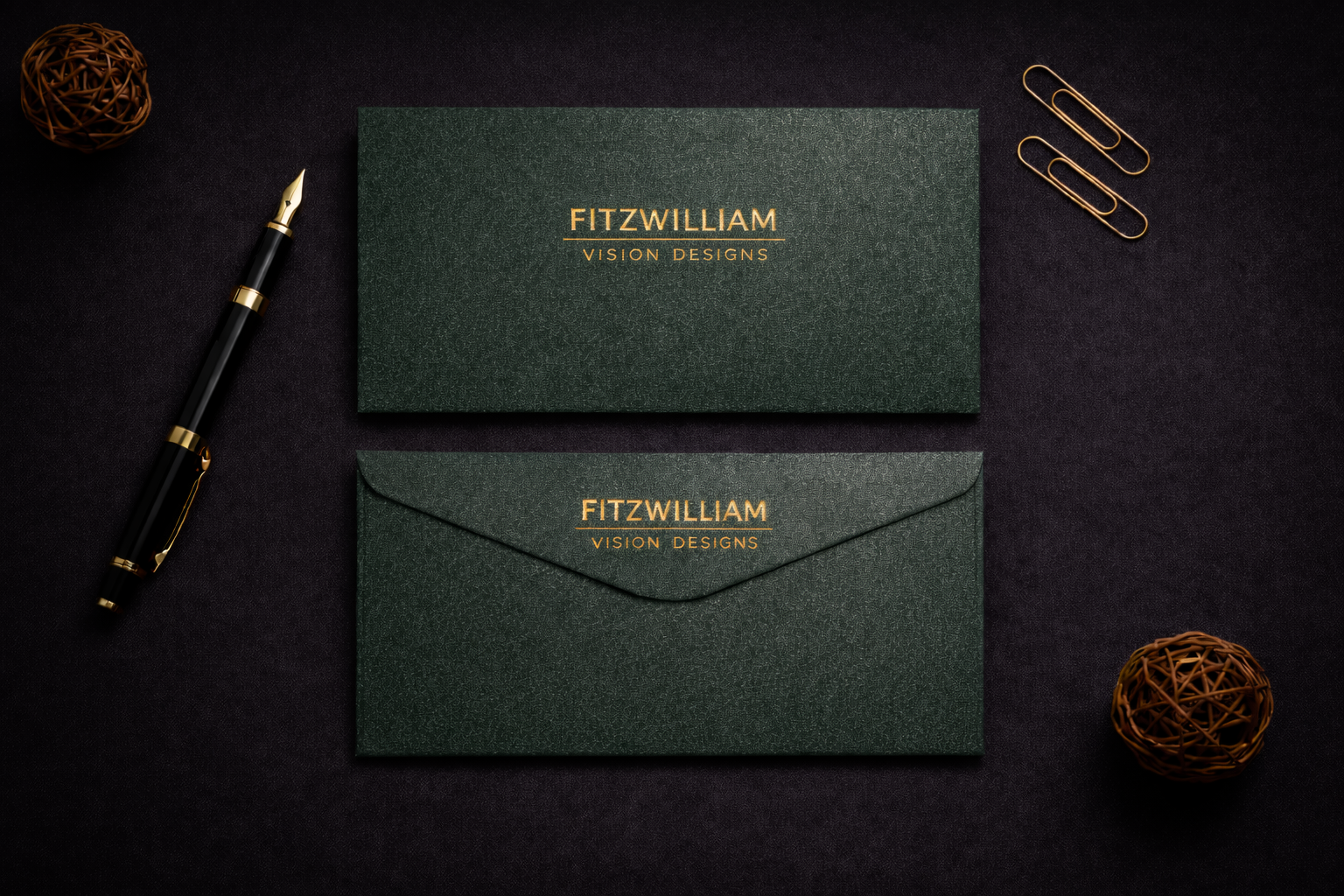
Deep Green and Other Quiet Luxury Tones
Deep green is often chosen by brands that want a premium look without obvious showiness. It can suggest heritage, composure, taste, and quiet confidence. Compared with black, it feels slightly softer. Compared with brighter colors, it feels more mature and controlled.
These kinds of tones are especially effective when a card is meant to communicate value through subtlety. In many cases, the strongest professional business cards are not the ones with the most dramatic color, but the ones with the most considered one.
Deep green, charcoal, muted navy, and warm neutral tones all belong to this category. They support a premium impression without trying too hard.
Choosing the Right Color for Your Role and Brand
Color should never be chosen in isolation. The right choice depends on your industry, your audience, and the kind of impression you want to leave. A legal professional may benefit from the restraint of black or navy. A creative brand may suit softer neutrals or a more design-led palette. A premium service business may benefit from a darker tone paired with elegant finishing.
This is where premium business cards become more than a format. They become a way of expressing positioning. The card should not simply look attractive. It should feel appropriate to the person or brand it represents.
The best choice is usually the one that continues to feel convincing in real life — in office light, natural light, and everyday use.
Color is one of the quietest but most influential decisions in business card design. In premium business cards, it shapes how people read professionalism, authority, confidence, and taste before they read any details.
Whether the choice is black business cards, navy business cards, or a lighter palette with a more contemporary feel, the principle is the same: color works best when it supports clarity and identity. The strongest cards are rarely the most decorative. They are the most coherent.