Custom business cards are often understood before they are read. The weight of the stock, the texture of the surface, and the precision of the finish all communicate something quietly but immediately: this brand pays attention. True quality is rarely created by design alone. It comes from the balance of material, craftsmanship, and detail.
For brands and professionals who want more than a standard print product, custom business cards offer a more distinctive kind of presence. They do not simply look better. They feel more deliberate, more considered, and more aligned with the identity behind them. In premium business card printing, that difference is what people remember.
Why Premium Business Card Printing Feels Different
The difference between an ordinary card and a premium one is rarely dramatic, but it is immediately felt. A better card feels more substantial in the hand, more precise in its finish, and more confident in its presentation. High-end business card printing is not about excess. It is about creating a result that feels intentional from the first touch.
That sense of quality usually comes from details working together: the right paper stock, the right thickness, the right finishing method, and the discipline to know when to stop. Premium printing is often defined as much by restraint as by technique.
The Quiet Importance of Materials
Before foil, before embossing, before letterpress printing, there is the paper itself. Materials shape the entire experience of a card, both visually and physically. A premium stock can make a minimal design feel sharp and composed, while a poorly chosen material can weaken even the most carefully designed layout.
This is why material selection should never feel secondary. Smooth stocks offer clarity and modernity. Heavier or textured papers introduce warmth, character, and weight. In premium printing, these choices do more than support the design. They become part of it.
Letterpress Printing and the Beauty of Precision
Among the most admired finishing techniques in luxury stationery, letterpress printing remains one of the most distinctive. It does not rely on shine or visual noise. Its strength lies in precision, depth, and the subtle tactile impression it leaves behind.
A well-executed letterpress detail gives a card a quiet authority. Typography feels sharper. Logos feel more deliberate. The overall design appears calmer, but more assured. It is one of the clearest examples of how craftsmanship can elevate a card without making it louder.
Embossing Printing and Debossing Printing: Depth with Restraint
Not every premium finish needs to shine. Embossing printing and debossing printing offer a different kind of sophistication — one built on form, texture, and control. Both techniques add dimension, but they do so in a way that feels refined rather than decorative.
Embossing lifts selected elements above the surface, giving logos or graphic marks a sculptural presence. Debossing does the opposite, pressing detail into the stock for a quieter and often more luxurious effect. For brands that value understatement, debossing can be especially powerful.
Both methods work best when the design already knows what matters. They do not rescue a weak layout. They reward a strong one.
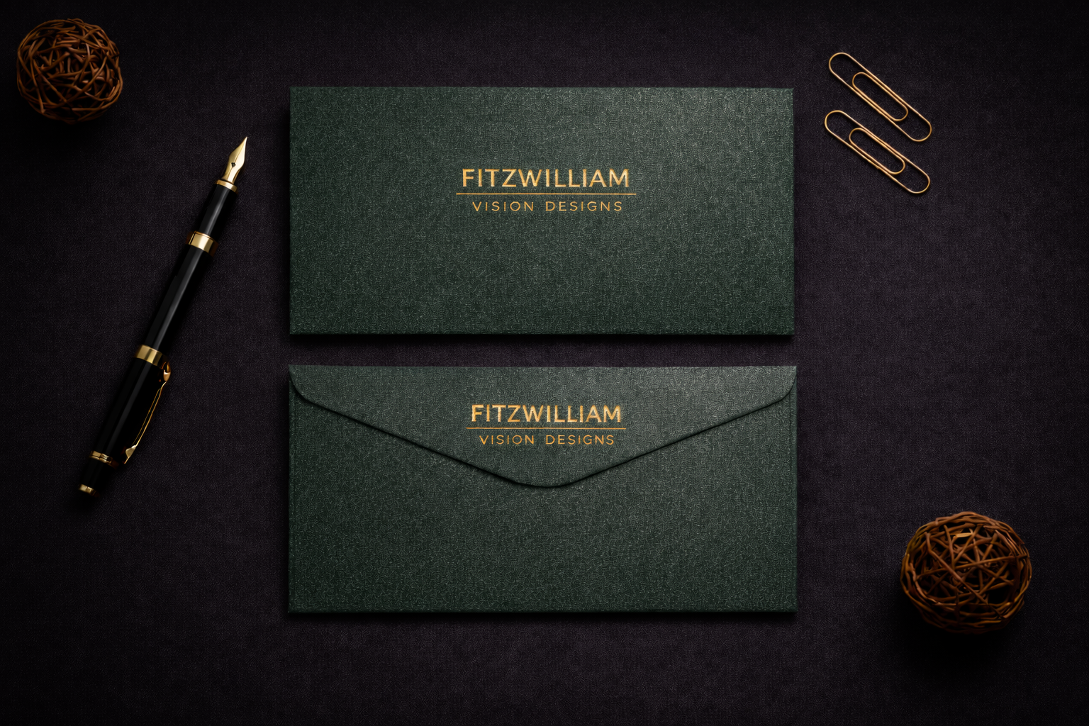
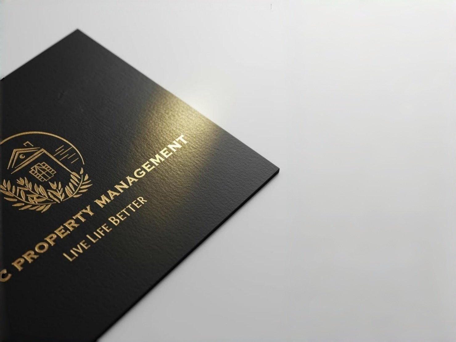
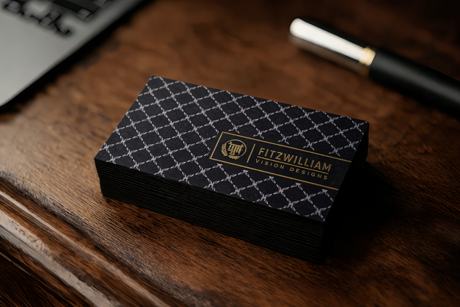
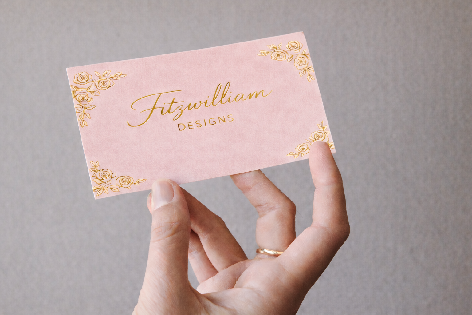
Foil Stamping Printing and Gold Foil Printing
Foil stamping printing introduces a different kind of emphasis. Where letterpress and debossing are often tactile first, foil is visual first. It draws the eye, adds contrast, and gives selected details a polished finish that feels unmistakably premium.
Among the many metallic finishes available, gold foil printing remains one of the most enduring. It carries warmth, clarity, and a classic sense of luxury. When used with discipline, it can make a name, monogram, or logo stand out beautifully without overwhelming the rest of the card.
In some applications, hot foil stamping is chosen for its crispness and precision. But the technique itself is never the point. A premium card does not feel luxurious because it uses foil. It feels luxurious because the foil is used with intention.
Why Craftsmanship Matters in Custom Business Cards
What separates custom business cards from standard ones is not simply personalization. It is the level of consideration behind the final object. A premium card reflects decisions: how the brand should feel, which details deserve emphasis, and which finishing techniques best support that identity.
That is why craftsmanship matters so much. It turns design into something tangible. It allows visual identity to move beyond the screen and into a physical form that people can hold, notice, and remember.
Choosing the Right Premium Printing Approach
The best premium business cards are rarely the most complicated. They are the most coherent. Some brands benefit from the quiet confidence of letterpress printing. Others suit the controlled depth of embossing printing or debossing printing. Some need the contrast and clarity of foil stamping printing or gold foil printing. The right choice depends on the brand, not the trend.
This is where premium printing becomes a matter of judgement. Good technique is important, but so is knowing what not to use. A card feels elevated when every element appears intentional, and nothing feels added for effect alone.
What makes custom business cards feel premium is not one finish, one material, or one visual gesture. It is the relationship between them. The right stock, the right level of precision, and the right finishing choices — whether that means letterpress printing, embossing printing, debossing printing, foil stamping printing, or gold foil printing — create a result that feels considered from every angle.